
Corporate Logo Design & Branding
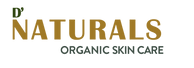
The corporate logo project is an assigned project on beauty company D’Naturals, was launched in the fall of 2021, and creates integrative and nutrient-dense formulations for skin, hair, and body.
The brand is a new venture offering radically sustainable, transparent, and obsessively safe plant-based beauty products. Helping customers feel grounded is the name of the game for D’Naturals.
Future Goals
-
Eco-friendly bottle buy-back program to help offset landfill waste revamping the product portfolio in the stores owing to the popularity of eco-friendly and sustainable products.
-
Its global presence with its first-ever beauty e-commerce store launched in the UK, India, and China.
-
Continuing its non-D2C growth plan to upscale across multiple channels and engage mass consumers.
Target Market

GENDER: Women
AGES: Young professionals, new mothers, and women 65+.
INCOME: middle or working class
LIFESTYLE: Working professionals, College youths, Work at Home-Mom
Initial Sketch

Color Scheme

Logo Architecture

• Resembling Leaves.
• Shape of the letter “D”.
• Dot above the leaves demonstrates the apostrophe after the letter “D”.
• An idea of a butterfly as a logo that shows Naturalness, Calmness, Relaxation, and Trustworthiness.
• Bold font used which is clean and modern.
Logo Responsiveness

Web Version

App Version
Wordmark Version


